Co-designing DocuSign’s Momentum24 Carbon Footprint Activation: Every Action Makes a Difference
Activating low carbon footprint art at DocuSign
DocuSign recently held their Momentum24 event in NYC. This event included a special activation centered on identifying ways to decrease one’s carbon footprint. Their team came to us to help co-design this activation and visually capture key takeaways. We were thought partners, illustrators, and fellow carbon footprint quiz takers. Here’s how the activation design and live illustration came together…
We worked alongside their team to help develop this workflow:
The DocuSign team would encourage attendees to stop by the expo floor’s Impact Lounge to take a short quiz, providing them with a carbon footprint score. Upon completing the quiz, participants would be asked to make 1 commitment to decrease their carbon footprint. To encourage participation, those commitments could be added freely to an approachably designed whiteboard in the room. From there, two Docusign team members would capture those commitments in a google doc, shared with our team.
In tandem, our team would be Zoom-ed into the event remotely (saving those carbon emissions, baby!) and following along on the shared google doc. We would screenshare our remote drawing via Zoom to an in-room screen, where participants could watch as we illustrated their commitments in real time!
Designing for a Green cause with purple
With that plan in place, we got to work creating a template that could be displayed in the lounge while we waited for commitments to roll in.
Template artwork
Crowd-sourced Capture
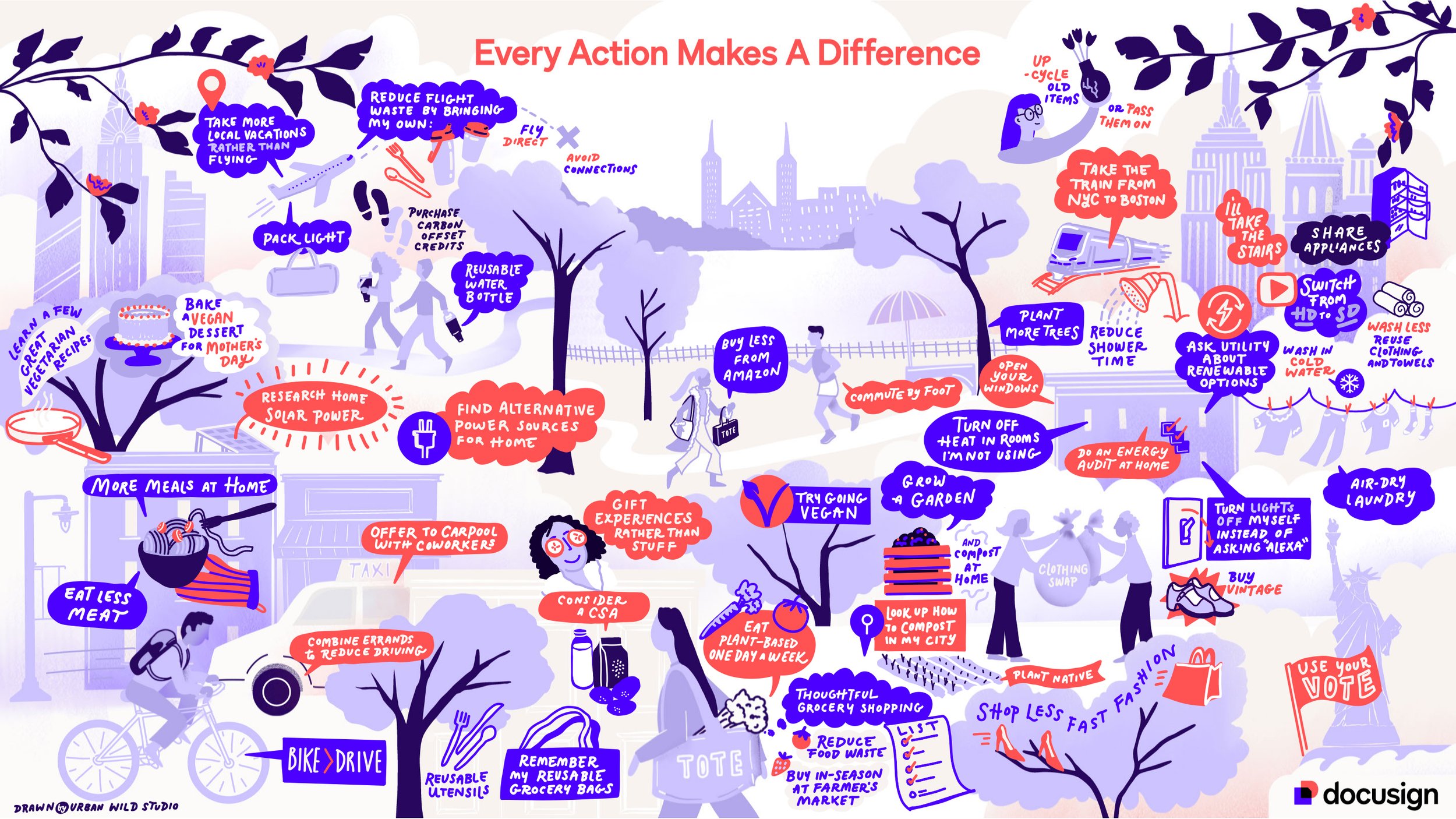
When event day came, we joined via Zoom, prepared to capture live! Once those commitments started flowing in, our artists drew them, adding consistently to the canvas throughout the duration of the day. The illustration came together in real-time, serving as entertainment in the lounge, and a lasting takeaway post-event. The end result is this vibrant, engaging, highly visual capture of each commitment made.
Completed Graphic Notes
Showcasing DocuSign’s new brand
A special bonus feature of this project was that Docusign was unveiling their new branding at Momentum ‘24 - That meant we had the privilege of working via NDA to design a template and illustration that complimented their brand update and made the activation feel timely, fresh, and up-to-speed with the latest Docusign happenings. It’s always a fun bonus to work with a fesh, vibrant palette!
All in all, this project went exactly as designed, and we’re thrilled with the outcome! If you’ve got grand ideas and moving pieces to form into a thoughtfully designed activation, reach out! We’d love to shine an illustrative light on your goals and visions.


